How to Structure a Homepage That Generates Leads in 2026
Your homepage is not just an introduction to your business.
In 2026, it is a conversion engine.
When someone lands on your homepage, they are asking one question:
Is this the right business for me?
If your structure does not guide them clearly and confidently toward action, you lose the opportunity.
Here is how to structure a homepage that actually generates leads in 2026.
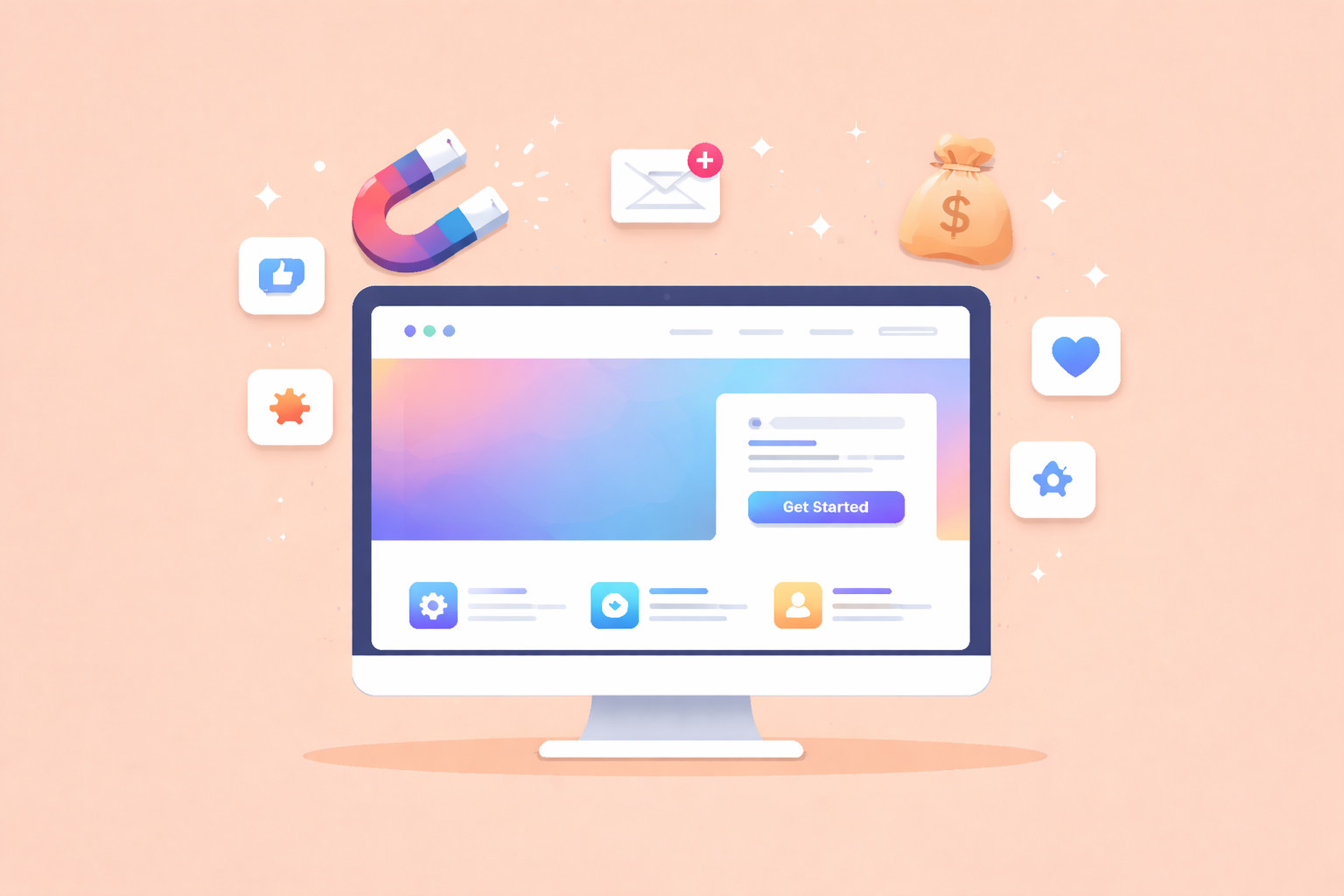
1. Above the Fold: Clear Positioning and One Primary Action
The first section is the most important part of your entire website.
Within seconds, visitors should understand:
- What you do
- Who you help
- What result you deliver
- What to do next
A strong above the fold structure includes:
- A benefit driven headline
- A short supporting paragraph
- One primary call to action
- Optional secondary action
- A relevant visual
Avoid clutter. Avoid vague messaging. Clarity converts.
2. Problem and Solution Section
After the introduction, address the visitor’s problem directly.
This section should:
- Acknowledge common frustrations
- Demonstrate understanding
- Introduce your solution clearly
For example:
Struggling to generate consistent enquiries online?
Our conversion focused websites are designed to turn traffic into qualified leads.
When users feel understood, trust increases.
3. Services Overview With Clear Pathways
Your homepage should briefly introduce your core services without overwhelming the visitor.
This section should:
- Highlight 3 to 5 key services
- Include short, benefit focused descriptions
- Link to dedicated service pages
Keep it concise. The goal is direction, not depth.
Clear pathways reduce confusion and improve navigation.
4. Social Proof Integrated Naturally
Trust is essential before someone makes contact.
Include:
- Testimonials
- Review ratings
- Client logos
- Brief case study highlights
Place social proof after strong claims.
For example, if you say you deliver results, immediately support that statement with evidence.
This reduces hesitation and builds credibility.
5. Process or How It Works Section
People want to know what happens next.
A simple 3 step process builds clarity and confidence.
For example:
- Book a consultation
- We develop your strategy
- You start generating results
Clear processes reduce uncertainty and increase conversions.
6. Objection Handling Section
Address common concerns before they prevent enquiries.
This might include:
- Transparent pricing approach
- Timeline expectations
- Guarantees or reassurance
- Frequently asked questions
When you proactively answer doubts, you increase trust.
7. Strong Final Call to Action
End your homepage with a clear and compelling invitation.
This section should:
- Reinforce your value
- Re state your primary benefit
- Include a bold call to action
For example:
Ready to Generate More Leads?
Book Your Free Strategy Call Today.
Make it obvious. Make it easy.
8. Mobile First Layout
In 2026, most visitors arrive via mobile.
Your homepage must:
- Load quickly
- Use short sections
- Have large tappable buttons
- Keep forms simple
- Maintain clear spacing
If mobile usability is poor, even strong messaging will not convert.
9. Keep Navigation Simple
Your homepage should not feel overwhelming.
Limit navigation to essential pages:
- Services
- About
- Case Studies
- Contact
Too many options create decision fatigue.
Simplicity increases action.
The Core Formula for 2026
A high converting homepage follows this flow:
Clarity
Problem
Solution
Proof
Process
Action
When structured correctly, your homepage guides visitors naturally toward contacting you.
Final Thoughts
In 2026, your homepage is not about saying everything.
It is about guiding someone to the next step with confidence.
If your homepage:
- Clearly communicates value
- Builds trust strategically
- Handles objections
- Repeats strong calls to action
- Works flawlessly on mobile
It becomes a lead generation asset rather than a digital brochure.